
SC Johnson: Operations
This art direction for SC Johnson was created for a course training their product assurance engineers on topics relating to product assembly. As the Art Director on this project, my role was to meet with the client and translate their ideas visually for an output in Articulate Storyline.
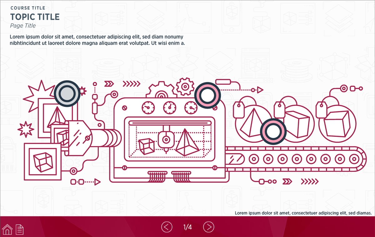
Because the end users for the course are engineers, I took a more technical approach that would best align with engineering. I integrated cues and principals from the traditions of Swiss graphic design, such as bold typography, modular layouts and in some cases, thin line artwork. Colors and interactive states were based on branding standards for this division of SC Johnson. The typeface used throughout the course, Gotham Narrow, was also found in the branding standards. To maintain the minimal aesthetic throughout the course, a single background was used containing a subtle pattern pertaining to product and packaging assembly.
NOTE: Certain content has been altered to respect the privacy of SC Johnson. This includes certain copy, which has been altered to Lorem Ipsum and the removal of company and departmental logos from the bottom navigation on the player.
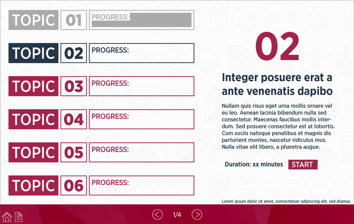
Menu Screen
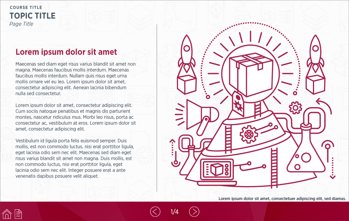
Text & Graphic Screen
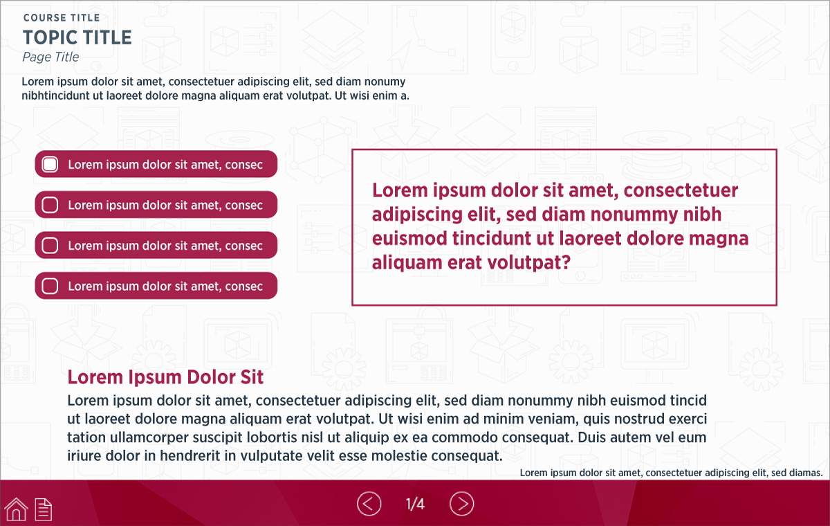
Multiple Choice Question Screen
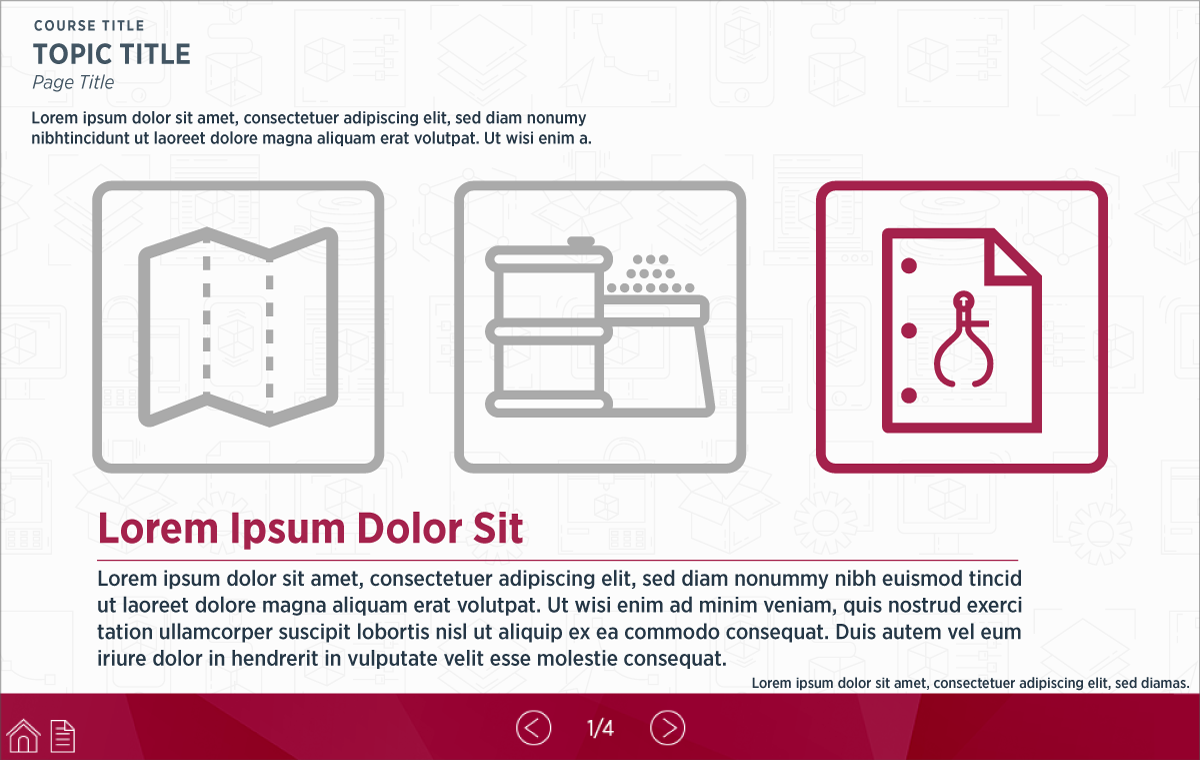
Photo Story (selectable icons and accompanying text) Screen
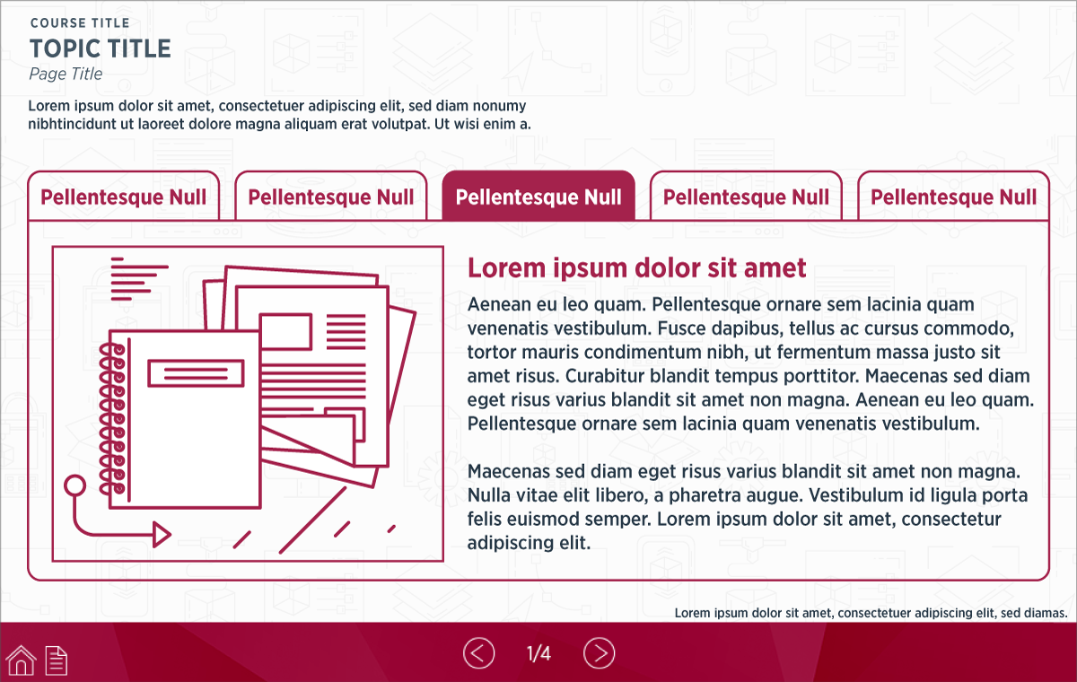
Tab Screen
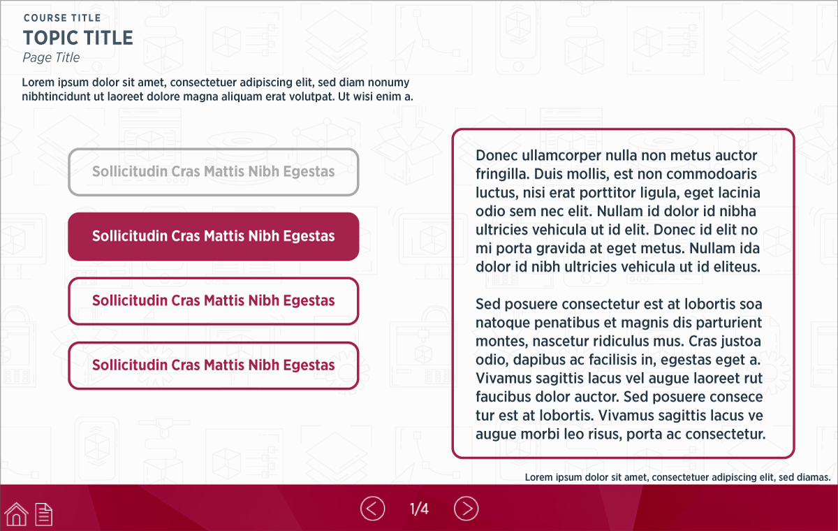
Hot Text (selectable text) Screen
Hot Graphic (selectable pins) Screen

Hot Graphic (selectable pins) Popup Screen